


- 5/08/2016
- 0 Comments
8th of January today - I registered yesterday for competition and did
some design work that I might talk about in more detail in one of my
future posts. I've started filing and buffing my castings, figuring out
that if I do this at least I will have much less work later on. But back
to my competition entries - as you know after last posts I gave myself
some time to cool off and look at them with clear eyes. It was good
thing too - I realised there was quite a lot of changes - big ones and
small that I needed to fix. Dissolve Collection - bracelet that I was
working on recently, still isn't fully finished, but I'm not planning to
do any more work on Veins.
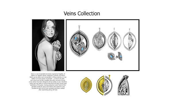


I've decided that I didn't like the face after all - I had an inkling that it became too much of distraction , and stud in the ear didn't look realistic enough - I've decided to go much more subtle with inspiration leaving it in the background with veins spreading onto model's back.


I've decided that I didn't like the face after all - I had an inkling that it became too much of distraction , and stud in the ear didn't look realistic enough - I've decided to go much more subtle with inspiration leaving it in the background with veins spreading onto model's back.


Stay golden!!!
- 1/07/2016
- 0 Comments
As you hopefully remember, I want to enter my past and current project
to Goldsmiths' competition, so just before Christmas I was working a lot
on getting my renderings done (we unfortunately can't get access to
Matrix at home due to licensing issues), and getting my head around how
to convey movement of my spinning pendant and how to show everything
that needs to be shown - inspiration, exploded views and close ups as
well as finished renderings on one sheet of A3 paper.
To start off I had a look at jewellery adverts. You might ask why would I look at adverts? Especially considering that it's competition, but if you really think about it, competition is just as much about selling your piece, or design as companies do in adverts, therefore, I felt it was a good starting point.


 Conclusion I came to after looking at these adverts - models. In jewellery adverts there is usually someone to wear the piece. There were some very creative ones from Harry Winston - the one with bird holding rings on its beak, and of course my favourite ones were from Van Cleef & Arpels -they are very clever with their visuals.
I've also looked at how to show movement of my pendant, through use of blur or stills showing moveable section in different positions.
 Then I started thinking about my visuals, and trying to find image of the model with good resolution.
 Which is harder than it seems, actually - getting right image, so that you can manipulate it in Photoshop so that it looks like someone is wearing necklace and earrings is tricky.

 Originally, bracelet entry was supposed to be similar to pendant - face of the model transforming into object of my inspiration for the piece, but it just didn't look right, so I had to try different combinations out.

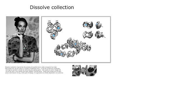
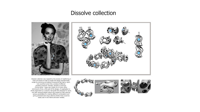 That's what I have so far - I'll probably leave it off, so I can look at them with clear eye.
To start off I had a look at jewellery adverts. You might ask why would I look at adverts? Especially considering that it's competition, but if you really think about it, competition is just as much about selling your piece, or design as companies do in adverts, therefore, I felt it was a good starting point.


I've also looked at how to show movement of my pendant, through use of blur or stills showing moveable section in different positions.


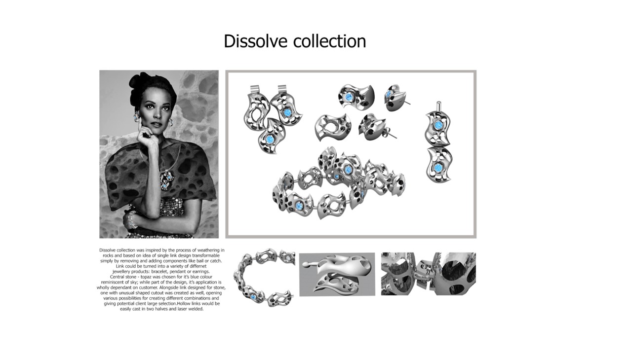
That's all for today,
Stay golden!!!
Jewellery adverts and images noted as research belong to their rightful owners/creators.
- 12/28/2015
- 0 Comments


